Sunday, 14 May 2017
How did you use Media technologies in the construction and research, planning and evaluation stages?
https://prezi.com/view/Qt8oB6X2XGCYeL1H0Mel/


How effective is the combination of your main product and ancillary texts?
In addition to creating a film, I had to create ancillary tasks - a poster and double page spread. In order to advertise and get the main product out there, a brand must be formed and established so that the film is recognised and there must be a sense of continuity.
The Film and The Poster
As the poster is advertising the film there must be a connection shown between the two. As people are more likely to see the film before they see the poster it must appeal to the audience and be intriguing enough for them to want to see the film.
 My film is about four media students that go missing after venturing out into the woods to film their media project hence the film being advertised as The Media Project. As it's a found footage film, the most popular film of the genre is The Blair Witch Project so I was inspired to name my film after it.
The Blair Witch Project used a missing poster at Sundance Film Festival by giving it out to those who attended to make them believe the film was actually real. I had the idea of turning a 'missing' poster into my actual poster because the girls have disappeared in the film and their footage has been found so people are now looking for them and advertising it through the use of the poster. After researching into existing missing posters, I found that they use the colours of red, white and black which fits in well to the horror genre as they are colours that are very common on horror film posters. A very typical feature of film posters is to include images of the protagonist and I have done this as the only four characters that are fully seen in the film are the only four characters seen on the poster so the audience can easily recognise the characters when they watch the film or when they see the poster. I lifted four images that have been previously taken as this is what is usually done of missing posters and edited them to have a black and white filter as my film contains dull, muted colours so I thought to reflect this in my poster. It is also conventional of horror film posters to include The girls are the focal point of the film so I chose to only include them on the poster with no other images. As my film is meant to be as natural and realistic as possible, I think the poster works well alongside it as it says 'missing' and the style of it with images and text describing the girls looks very realistic.
As my film was shot in the dark to show a connection and brand I chose to use black as my background colour. The colour black also has negative connotations such as death and danger which are both themes that are found in my film and is also a typical feature on horror film posters. On the bottom of my poster I included the text "In December 2016, four media students disappeared in the woods near Brambleside, Kettering whilst shooting their coursework. A few months later their footage was found..." This same text appears at the start of my film so it is almost a tag line and shows there is a link between the poster and film because they are both telling the same story. The poster can be seen as an introduction to the film through this as it begins to tell the story of the girls. In order to make sure I didn't lose the effect of the poster being a film poster and not a missing poster I included film poster features such as the date, studio logos and credits.
I think there is a strong connection because the poster interlinks well with the story line because the footage of the girls has been found and the poster is helping search for them. I think the poster works effectively side by side due to the fact the film explains the story behind the poster meaning that in order for the audience to gain full understanding they must watch the film which is essentially the point of the poster.
The Film and Double Page Spread
 The image I used in the double page spread was taken to be the image on my poster however after experimenting with it for the poster I decided to use it instead for my double page spread. I edited it to have a black and white filter so it would fit in with the poster as well as the film as previously mentioned it has muted colours. Many images associated with horror films tend to not include brightly coloured images and as I took this in the day it only made sense to darken the image. I chose to photograph Eva as she is the 'final girl' who is left trying to solve what happened and we never find out what happens to her at the end of the film. This shows a connection between the double page spread and film as the double page spread hints at the idea that Eva's character may be slightly more important than the others. Also the location of the image is the same as where I filmed the rest of the film so there is another connection in the location of the film. Also not all of her face is shown and I found this is a typical convention in the horror film, the image shows that she is slightly hiding behind the tree suggesting she is in fear or not wanting to be seen by something/someone. This is effective with the film because she is the last girl who hasn't been hurt showing she may be hiding from the antagonist that is never revealed.
I gave the right side of the page a black background like the poster and for similar reasons to the poster as black has negative connotations in the horror genre. I used this font for the 'The Media Project' as I thought it looked like it was almost similar to the font used in 'The Blair Witch Project' and I thought it looked like the typical kind of fonts you would see in horror films. I chose to keep the rest of the font in white to not overwhelm the reader and keep the double page spread minimal like I have with the poster as the two must work well alongside each other. As half on my double page spread is an image it left me little space to write a full review however as the image is powerful and close up like a typical horror film image, I wanted it to stand out unlike other reviews which often tend to include several images of still shots. The review is a short introduction crediting the director, outlining the story and then beginning to explain how the film was shot. I also included a quotation over the image in the colour red sticking to theme as I saw in other magazines that they had done this and it made my work look more professional.
I think my double page spread film review worked well combined with my film as there is a link between the images due to the location and character making it recognisable and unifying the brand. In addition with the poster, there is a strong house style and theme maintained. There is a story linked within them all as the film tells the story behind the poster and the review tells the audience how the film was put together.
The Film and The Poster
As the poster is advertising the film there must be a connection shown between the two. As people are more likely to see the film before they see the poster it must appeal to the audience and be intriguing enough for them to want to see the film.
 My film is about four media students that go missing after venturing out into the woods to film their media project hence the film being advertised as The Media Project. As it's a found footage film, the most popular film of the genre is The Blair Witch Project so I was inspired to name my film after it.
 The Blair Witch Project used a missing poster at Sundance Film Festival by giving it out to those who attended to make them believe the film was actually real. I had the idea of turning a 'missing' poster into my actual poster because the girls have disappeared in the film and their footage has been found so people are now looking for them and advertising it through the use of the poster. After researching into existing missing posters, I found that they use the colours of red, white and black which fits in well to the horror genre as they are colours that are very common on horror film posters. A very typical feature of film posters is to include images of the protagonist and I have done this as the only four characters that are fully seen in the film are the only four characters seen on the poster so the audience can easily recognise the characters when they watch the film or when they see the poster. I lifted four images that have been previously taken as this is what is usually done of missing posters and edited them to have a black and white filter as my film contains dull, muted colours so I thought to reflect this in my poster. It is also conventional of horror film posters to include The girls are the focal point of the film so I chose to only include them on the poster with no other images. As my film is meant to be as natural and realistic as possible, I think the poster works well alongside it as it says 'missing' and the style of it with images and text describing the girls looks very realistic.
As my film was shot in the dark to show a connection and brand I chose to use black as my background colour. The colour black also has negative connotations such as death and danger which are both themes that are found in my film and is also a typical feature on horror film posters. On the bottom of my poster I included the text "In December 2016, four media students disappeared in the woods near Brambleside, Kettering whilst shooting their coursework. A few months later their footage was found..." This same text appears at the start of my film so it is almost a tag line and shows there is a link between the poster and film because they are both telling the same story. The poster can be seen as an introduction to the film through this as it begins to tell the story of the girls. In order to make sure I didn't lose the effect of the poster being a film poster and not a missing poster I included film poster features such as the date, studio logos and credits.
I think there is a strong connection because the poster interlinks well with the story line because the footage of the girls has been found and the poster is helping search for them. I think the poster works effectively side by side due to the fact the film explains the story behind the poster meaning that in order for the audience to gain full understanding they must watch the film which is essentially the point of the poster.
The Film and Double Page Spread
 The image I used in the double page spread was taken to be the image on my poster however after experimenting with it for the poster I decided to use it instead for my double page spread. I edited it to have a black and white filter so it would fit in with the poster as well as the film as previously mentioned it has muted colours. Many images associated with horror films tend to not include brightly coloured images and as I took this in the day it only made sense to darken the image. I chose to photograph Eva as she is the 'final girl' who is left trying to solve what happened and we never find out what happens to her at the end of the film. This shows a connection between the double page spread and film as the double page spread hints at the idea that Eva's character may be slightly more important than the others. Also the location of the image is the same as where I filmed the rest of the film so there is another connection in the location of the film. Also not all of her face is shown and I found this is a typical convention in the horror film, the image shows that she is slightly hiding behind the tree suggesting she is in fear or not wanting to be seen by something/someone. This is effective with the film because she is the last girl who hasn't been hurt showing she may be hiding from the antagonist that is never revealed.
I gave the right side of the page a black background like the poster and for similar reasons to the poster as black has negative connotations in the horror genre. I used this font for the 'The Media Project' as I thought it looked like it was almost similar to the font used in 'The Blair Witch Project' and I thought it looked like the typical kind of fonts you would see in horror films. I chose to keep the rest of the font in white to not overwhelm the reader and keep the double page spread minimal like I have with the poster as the two must work well alongside each other. As half on my double page spread is an image it left me little space to write a full review however as the image is powerful and close up like a typical horror film image, I wanted it to stand out unlike other reviews which often tend to include several images of still shots. The review is a short introduction crediting the director, outlining the story and then beginning to explain how the film was shot. I also included a quotation over the image in the colour red sticking to theme as I saw in other magazines that they had done this and it made my work look more professional.
I think my double page spread film review worked well combined with my film as there is a link between the images due to the location and character making it recognisable and unifying the brand. In addition with the poster, there is a strong house style and theme maintained. There is a story linked within them all as the film tells the story behind the poster and the review tells the audience how the film was put together.
In what ways does your media product use, develop or challenge forms and conventions of real Media products?
Forms and conventions define a genre and are the way in which something is done. Within my work i have used, challenged and developed some of these forms and conventions. My film comes under the sub-genre of psychological found footage. This is not as much of a popular sub-genre compared to others so therefore there are not as many codes and conventions, however the prime example of the genre is the Blair Witch Project which I took a lot of inspiration from.
Many horror films have similar themes traits and styles that have been developed over time. One of the typical conventions of mise-en-scene, more specifically the location are characters being somewhere that lacks access and has no one around to help. For example, the woods is where I decided to locate my film as it's away from civilisation conforming to the stereotypical convention of the characters being isolated away from help, enhancing the difficulty of their situation and creating fear that something bad will happen to the characters. 'The Blair Witch Project' which i was inspired by is filmed in the woods so it was my ideal location. Films of the horror genre tend to be set at night time or in darkness as it forces the characters to naturally be more alert making the audience more on edge. My media product uses this convention as I decided to film later in the day so it would be dark. Another aspect of the mise en scene are props, typical props that have come up in horror films are guns, knives and sometimes a painting/antique or something ancient to create a sinister atmosphere. Specifically in a paranormal/psychological film they have bibles and crucifixes to involve religion and symbolising the devil which is often used to anger something that is haunting the characters creating more violence. However, I decided to challenge this and not use any props of that type, this is due to the fact I'm following the sub genre of a psychological found footage so it needed to be as realistic and believable as possible.
Sound/music in horrors is an important factor as it tends to become more tense and fast paced as we are lead into a tense scene. It indicates to the audience that something is going to happen creating more fear and excitement There's often exaggerated digetic sounds that create lot of tension. However, I didn't use any pre recorded added sounds due to my subgenre of choice. As my characters were filming themselves it would seem unnatural to add music into the background and would take away from the realistic aspect of the footage. In terms of characters, I had an all female cast that didn't come conform to the typical female characters that are found in the horror genre. For Instance 'the blonde' that usually dies first and has the 'slutty' costume or 'the Virgin' who is always the character that survive as they are pure and not affected by evil. I found that creating a short film meant it was more difficult to create detailed characters that the audience could form a strong relationship with. Another character I did not conform to because i had an all female cast was the typical 'Jock/Athlete' that's everyone looks to for guidance and saves the day. But this may be due to the fact that these type of character is usually found in teenager horrors. I personally think that my media product challenges The Male Gaze Theory that is usually applied to horror films. The male gaze theory is the way in which women are visually represented in the media presenting them as objects of male pleasure. I think I challenged this through my actors costume as they were wearing clothes that covered up their bodies preventing the opportunity for my audience to sexualise them. In the horror genre the female characters as previously mentioned can be presented as 'slutty' and weak creating the 'damsel in distress' persona. Although in my short film the actor's begin to disappear one by one and can't seem to help themselves the 'damsel in distress stereotype doesn't appear as there are no male characters available to save them.
Iconography is an area where my short film used the conventions of real media products. The fear of the unknown has become more popular in recent films more specifically in psychological/paranormal horrors the characters fear the unknown which leads the audience to also be scared. I applied this to my film as the girls disappear one by one but it remains unknown as to why, how or where they disappear to. Jumpy scenes where things tend to pop up in front of the screen with loud sounds or unexplained noises are also very common. In the scene where one of the girls (Yasmine) runs back to the car, a strange figure comes up from behind covering her mouth and grabbing her neck pulling her into the darkness. This created a jump scene as before she's grabbed it is calm and quiet making her scream unexpected and jumpy. I also created a jumpy scene where Andrietta goes to look for Yasmine and thinks she has found her so is calling her name and taps her shoulder but the figure then turns around to grab her causing her to scream. The theme of good vs Evil has always been present in the horror genre and I applied this to my short film as the unknown antagonist is evil for attacking innocent. A feature I picked up from the Blair Witch Project is at the start there is short paragraph quickly detailing the story and I chose to use this is mine to make the story line clear and explain that it is a found footage film.
Typically editing follows a strict continuity so that the audience can see a clear storyline making the jumpy seems more effective as the audience are clear on the plot. I used continuity editing through the technique of cross cutting between the two different cars and between the different cameras that the actors were holding in order to understand the story from different aspects. Although I was going from different cameras to different scenes I still feel as if my audience could follow the storyline as well as follow the different characters but I think I've also challenged real media text as usually horror films are filmed from the protagonist and antagonist perspectives however mine was done from several different perspectives. I did feel like this made me challenge the normality of camera work as in most horrors the actors don't hold the cameras and film themselves meaning I didn't use the typical angles and shots that would usually be identified such as over the shoulder shots and high angles. It would be unnatural for my actors to be filming themselves from professional angles as the aik of thr film is to be as natural as possible and would steer away from the style of genre. On the other hand as my characters were filming themselves it meant there were many closeups which is a conventional angle that is used. Found footage horror films as a whole aren't as popular as other subgenres of meaning it was a challenge within itself.
Ancillary Tasks
Poster
As for my ancillary tasks I didn't conform to the usual conventions as much as I did with my film. My poster was done in the style of a missing poster, I was inspired by a poster that was released alongside The Blair Witch Project at a film festival to make the audience believe it was real. The missing poster included single square pictures of the three protagonist which inspired me to get a picture of each of my characters in a black and white filter to portray a dark and mysterious vibe. A typical features of a horror film poster often includes one dark figure which is usually the antagonist, however as in my film we never see the villain I decided to use the victims which continued to conceal the identity of the antagonist. The images on posters are usually close up and have been manipulated to look unnatural and eerie, capturing the audiences attention. Although I used four separate images they are all close up however they have not been manipulated and the girls are looking happy which creates an aspect of sympathy and desperation because they have gone missing. Sometimes there is a use of the location in the poster but I felt that including an image of the wood would detract from the idea of a missing poster. A convention I identified and followed is that there is always a lack of text and on my poster I have simply included a few lines about the film and the credits. In terms of colours I conformed to the typical. Horror film posters tend to use dark and dull colours as they are associated with terror mystery and death. They also tend to use the colour red which is intense and stands out from the dark colours as it has the conotations of blood which can be linked to violence. They also often have unnatural lighting which create dull/dark lighting creating uncertainty and fear making the audience more intrigued to watch the film. On my poster I used the colour black which is dark and dull conforming to the convention creating uncertainty and I also used red for some of the font so it stands out and signals to the audience that the film could potentially involve blood and danger. The darkness that is drawn from the poster instantly signifies to the audience that they will be watching a film that could involve an unhappy ending and my film is a cliffhanger that shows no sign of a happy ending.
Double Page Spread
For my double page spread I wanted to have a flow from the poster that I have created so I aimed to keep it simplistic but intriguing. After searching for many different styles of double page spread's and not finding any I particularly liked, I looked back on my own work from last year and used that for inspiration. As I found that many people liked the style I had gone for I decided to use the same sort of minimalistic approach again. The image on the left was originally shot to be used a for my poster as it has the typical camerawork of being a close up shot and the mise en scene fits the genre as it is located in the woods therefore i conformed to the stereotype. But I felt that it worked better on my double page spread once I had edited it as it fully captures the attention of the audience. I made my actor look into the camera with no expression and half her face as it shows mystery because not all of her has been revealed. I realised that many images of double page spreads of horror films are still shots from the film however I found because my film was shot by the actors themselves it wasn't very clear and it was hard to find shots that could be used for my DPS. Therefore I challenged this convention and used a separate image specifically shto for the purpose of the poster or DPS. I also realised that many double page spread's include more than one image but I personally didn't like the look of this as I found it overcrowding and I experimented with using more than one image but found it overwhelmed the page so stuck with one. I used the same colours that I used on my poster to maintain a house style and theme. I used black as the background colour because it again creates a dark, dangerous and mysterious vibe and my film is shot in the dark so it only made sense to reflect this in my DPS. A typical convention of any film review DPS is that there are reviews included, I decided to include a quote as I saw that many other DPS's included this. I did mine in a red font to continue the colour scheme over the image to make it look more professional. I did the rest of the font in white on the rest of the rest of the DPS as I wanted it to stand out and i wanted to maintain a style and brand.
Overall, I think I conformed to many forms and conventions of the psychological found footage genre which I think was inevitable to happen as there are not many films of the gente out there so i would more or less stick to what I had researched. I used the a feature of real media products with mise en scene by filming in darkness and the location of the woods. I challenged the typical aspects of the horror genre as a whole, for example by not adding sound or using the stereotypical camera shots and angles. I also challenged the male gaze theory as I felt no need to sexualise the female body in order to heighten the fear in my film or improve my storyline. In terms of my ancillary tasks, I think I slightly branched out of the usual poster by creating a missing poster as my poster to advertise. For my double page spread I didn't use images from my film which I found proved to be a popular concept so I perhaps challenged the genre again. However, i stayed true to the typical colour scheme that is found of posters such a red and black due to the fact they have popular connotations of darkness, danger and mystery.
Wednesday, 10 May 2017

Thursday, 4 May 2017
Tuesday, 25 April 2017
Short Film Theory
There are theories behind films that have been discovered and created across time. A very popular one is The Narrative Theory created by Todorov.
His theory contained five main steps that you can essentially apply to most narratives as they all follow the same pattern and these steps are:
1. Equilibrium - the first part of the story displays a happy start where the majority of the characters are content and everything is as it should be
2. Disruption - the second part of the story features a problem or some sort of disruption occurs
3. Recognition - this is the part where the characters identify the problem. It's not always apparent at first and often in horror films the audience realise the problem before the characters do
4. Attempt to Repair - this is where an attempt to fix the damage and restore the problem takes place
5. Return/Restoration to new Equilibrium - this is the finale of the plot and the problem is solved and normality resumes again
An example of this is in The Hunger Games:
1. Everything is at an equilibrium, Katniss has gone to hunt in the forest as she usually would

2. The disruption begins when Katniss' sister Rose is chosen to be tribute but the Katniss volunteers as tribute
3. Katniss recognises the situation she has placed herself in and this is the recognition stage

4. The attempt to repair is Katniss taking part in the hunger games and the death of Rue makes her more determined to win the game
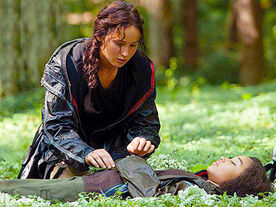
5. A new equilibrium is installed when Katniss and Peeta win the game together and return to their homes with their family and friends.

His theory contained five main steps that you can essentially apply to most narratives as they all follow the same pattern and these steps are:
1. Equilibrium - the first part of the story displays a happy start where the majority of the characters are content and everything is as it should be
2. Disruption - the second part of the story features a problem or some sort of disruption occurs
3. Recognition - this is the part where the characters identify the problem. It's not always apparent at first and often in horror films the audience realise the problem before the characters do
4. Attempt to Repair - this is where an attempt to fix the damage and restore the problem takes place
5. Return/Restoration to new Equilibrium - this is the finale of the plot and the problem is solved and normality resumes again
An example of this is in The Hunger Games:
1. Everything is at an equilibrium, Katniss has gone to hunt in the forest as she usually would
2. The disruption begins when Katniss' sister Rose is chosen to be tribute but the Katniss volunteers as tribute

3. Katniss recognises the situation she has placed herself in and this is the recognition stage
4. The attempt to repair is Katniss taking part in the hunger games and the death of Rue makes her more determined to win the game
5. A new equilibrium is installed when Katniss and Peeta win the game together and return to their homes with their family and friends.
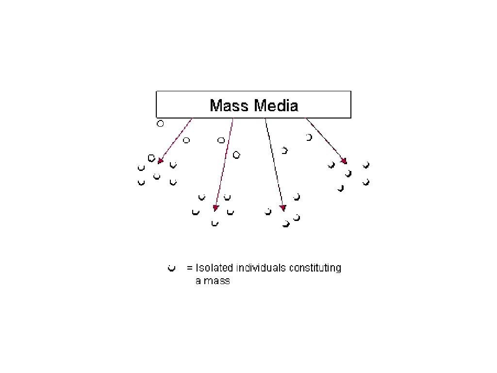
Hyperdermic Needle Model
The Hyperdermic Needle Model theory implies that mass media has a direct, immediate and powerful impact/effect on its audiences.
The theory suggests that the mass media could directly influence a large group of people by 'injecting' them with messages that have been designed to trigger a response. It suggest that there is a powerful and direct flow of information from the sender to the receiver. It gives the implication that media messages are injected into passive audiences who are then immediately influenced the message. The theory expresses the dangerous side of the communication in media as the audience is powerless in resisting the impact of the message that has been designed to be sent out. As audiences are passive, there is no escape from the effect of the message in this model and there is no other source of information.
Factors that contribute to the "strong effects" theory of communication include:
Media theorists have classified the "War of the Worlds" broadcast as the archetypal example of the hypodermic syringe model. They said the message was "injected into the bloodstream" of the public. The effect of the broadcast demonstrated the power the media has to manipulate the passive public and this was a primary example of ways the audience can shape audience perception.
The theory suggests that the mass media could directly influence a large group of people by 'injecting' them with messages that have been designed to trigger a response. It suggest that there is a powerful and direct flow of information from the sender to the receiver. It gives the implication that media messages are injected into passive audiences who are then immediately influenced the message. The theory expresses the dangerous side of the communication in media as the audience is powerless in resisting the impact of the message that has been designed to be sent out. As audiences are passive, there is no escape from the effect of the message in this model and there is no other source of information.
Factors that contribute to the "strong effects" theory of communication include:
- the fast rise and popularisation of radio and television
- the emergence of the persuasion industries such as propaganda and advertising
- the Payne Fund studies that looked at the impact of films on children in 1930s
Media theorists have classified the "War of the Worlds" broadcast as the archetypal example of the hypodermic syringe model. They said the message was "injected into the bloodstream" of the public. The effect of the broadcast demonstrated the power the media has to manipulate the passive public and this was a primary example of ways the audience can shape audience perception.
How does this affect my short film?
As audiences are so easily impacted by what they see in different outlets of media, what I put in my piece will have a direct impact on my audience. If I was making a slasher film the amount of violence in it would have to be noted as members of the audience may copy the actions increasing the amount of danger and crime rate in real life. This also contributes to the age ratings on films, for example a slasher film would have to have a higher age rating as adults are less likely to mimic what they've seen as they clearly know what is wrong from right. As I am making a psychological found-footage short film it is a lot more realistic meaning that audiences will be able to relate to it more deeming it more effective on them. Therefore I must be aware of the message I put into my film to ensure my audience don't have a confusion between reality and what's been made up.
Subscribe to:
Comments (Atom)